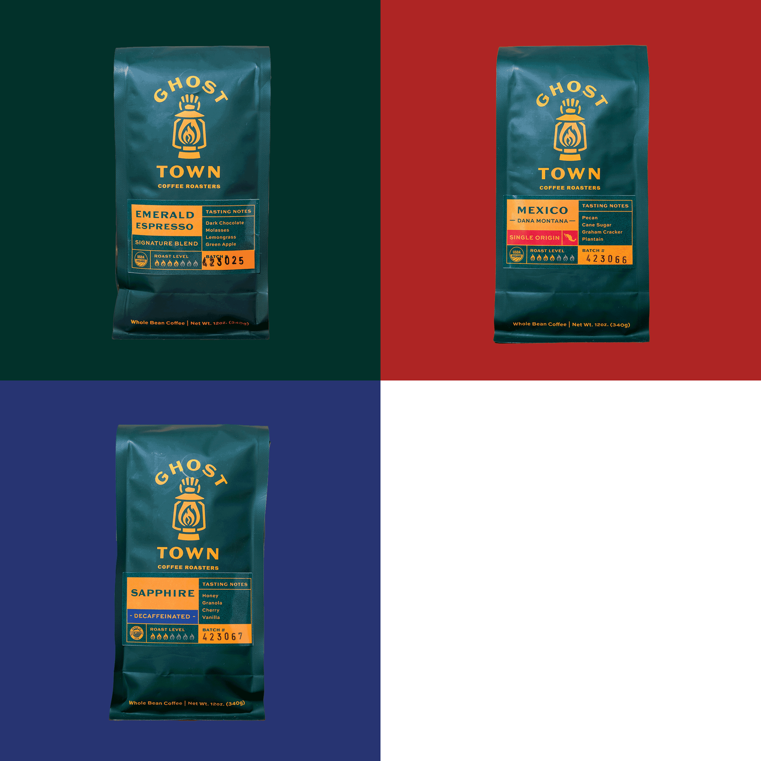
Ghost Town Coffee
Since 2006, Ghost Town Coffee Roasters has guided people to great coffee through their on-site training, equipment maintenance, sourcing, roasting, and customer service. They came to Hardy to help develop a bespoke strategy and refreshed identity that better articulated the core of who they are and what they offer.
Through surveys, it was clear that Ghost Town was perceived as a reliable guide throughout the entire coffee process–from the farms where their coffee is sourced, to the local wholesaler or employee who is eager to craft quality coffee. It was also evident that their existing orange color and lantern symbol held strong brand recognition. With all this important information, we updated their primary color to forest green and tweaked the orange to be closer to the color a lantern emits. The ghost skeletal hand that holds the lantern emulates Ghost Town’s “guiding” approach and is also the inspiration for their secondary tagline; “the Spirit of Community”.
My Contributions
Customer & Employee Surveys
Brand Strategy
Persona Development
Tagline
Work Completed at Hardy Brands
Designers: Erin Corsi and Jessie Pingree
Creative Director: Tyrel Thornton


